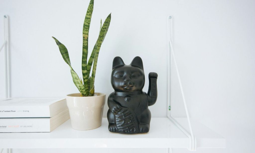
Built-in shelves or an open bookcase in a living room can not only be used for storage or holding books and candles but also to add personality to the space. This can be in the form of framed photos of loved ones or special life moments, artefacts picked up on travels, or even passed-down family heirlooms.
But displaying the items on your shelves so that they appear deliberately placed and the overall aesthetic appears cohesive requires skill — in fact, says Laura Hammett, co-owner of her eponymous interior architecture and design studio, styling display shelves is notoriously difficult.
“You often end up with so many pieces, and it can look quite cluttered and busy,” Hammett says in an informational clip she shared to TikTok. “So, I’m going to talk you through some of my rules.”
Ahead, we break down what Hammett’s rules are, so you too can end up with aesthetic shelves.
Think About Balance
When styling display shelves, you want to always be thinking about the balance – what’s placed on higher shelves versus what’s placed on lower shelves, says Hammett.
“When you’ve got a stack of shelves like this, […] look at it like a pyramid,” she says. “Go big at the top, so your eye needs to really be drawn up and then start bringing things like photo frames down to eye level.”
Candles and flowers should also be placed at eye level. The shelves below eye level are to be used for items that are bold but simple. One of the examples Hammett uses in the clip is a decorative box used for media accessories like remote controls or headphones, which she places on a stack of books.
The other example she uses is a set of antique brass bookends. Both bookends are placed next to each other on a stack of books, working as sculptural pieces.
Place Photo Frames in Pairs
Another rule Hammett likes to follow is to use photo frames as a pair. In her example, she places two ivory frames together, one slightly in front of the other. She shares that she also favours placing the frames vertically, in what she calls portrait mode, rather than horizontally, on their side.
Add Something Living
As is the case when styling coffee tables, Hammett says she also recommends you add “something living” on shelves. In her example, she’s placed a pot of fake flowers on the shelf, which she says gives the shelf a “nice organic feel”.
“You want to make sure it’s at a natural height, so don’t have it too high, don’t have it too low,” she says. “Have it where it’s almost at eye level or just below.”
Frequently Take a Step Back
Throughout the process of styling your shelf, Hammett says to ensure you keep standing back and looking at the shelf from a distance from a few different angles. That way, you can make sure you’re happy with the balance of objects on each shelf and that they all work well together.
Don’t Be a Stickler For the Rules
The final rule to follow, says Hammett, is to not stick too closely to the above rules, as they’re meant to be used merely as guidelines. If there’s one rule you should be sure to adhere to, though, it’s that you love everything that’s on display.
“It should be a space that you really enjoy sitting back and looking at,” she says.
You can watch the clip in full below.
@laurahammett.interiors How To: Shelf Styling #shelfstyling #shelves #shelfdecor #homestyling #interiordesign ♬ original sound – Laura Hammett Interiors
Related: Into Scandi Home Décor? These Are the Accounts to Follow That Aren’t IKEA
Related: What’s Behind the Boom in Brass Home Décor?
Read more stories from The Latch and subscribe to our email newsletter.

