
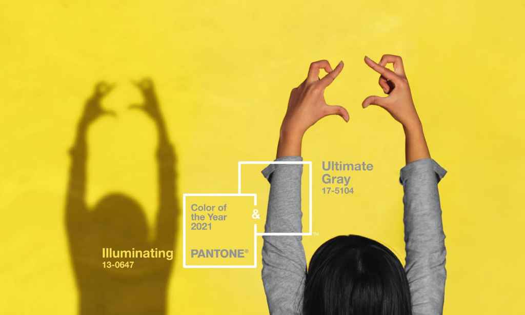
Every year, homemakers, interior enthusiasts, decor specialists and design consultants wait with bated breath to find out Pantone’s Colour of the Year, and this year, Pantone’s Colour of the Year for 2021 has been revealed as Ultimate Gray and Illuminating.
It’s the second time the colour authority has chosen two shades to represent the year ahead — in 2015, Pantone chose both Serenity and Rose Quartz.
On its decision to anchor 2021 with Ultimate Gray and Illuminating, Pantone says these are two shades that “highlight how different elements come together to support one another”.
“Practical and rock solid but at the same time warming and optimistic, the union of Ultimate Gray and Illuminating is one of strength and positivity. It is a story of colour that encapsulates deeper feelings of thoughtfulness with the promise of something sunny and friendly.”
Why are Ultimate Gray and Illuminating Pantone’s Colour of the Year 2021?
Earlier this month, The Latch predicted an optimistic shade of pale yellow from the Pantone Colour Institute. A colour of hope, clarity, energy and optimism, yellow could well be an appropriate way to signify a new beginning and a considerate approach to the new year. The colour authority also hadn’t employed a yellow as its Colour of the Year in at least 10 years.
Today, we’re pleased to say our rationale was correct. “As people look for ways to fortify themselves with energy, clarity, and hope to overcome the continuing uncertainty, spirited and emboldening shades satisfy our quest for vitality. Illuminating is a bright and cheerful yellow sparkling with vivacity, a warming yellow shade imbued with solar power,” Pantone says in a press release.
Ultimate Gray was a surprise to us, however, the thought behind the colour choice couldn’t be more poignant. “Ultimate Gray is emblematic of solid and dependable elements which are everlasting and provide a firm foundation. The colours of pebbles on the beach and natural elements whose weathered appearance highlights an ability to stand the test of time, Ultimate Gray quietly assures, encouraging feelings of composure, steadiness and resilience.”
Together, the two shades solidify two of our human needs as we enter a new year — one that follows a series of unprecedented and at times, devastating, events.
“A message of happiness supported by fortitude, the combination of Ultimate Gray and Illuminating is aspirational and gives us hope. We need to feel that everything is going to get brighter – this is essential to the human spirit.”
Pantone’s Colour of the Year 2021 in the home
In choosing shades that anchors the core intentions and ideas of the next year, the colour authority inadvertently sets the tone for home decor themes all around the world, and kicks off a long production line of pieces thought out to help people everywhere inject the shade, and its values, into their lives at home.
Ultimate Gray and Illuminating as the Pantone Colour of the Year for 2021 will see homemakers embrace the grounding shade of Ultimate Gray within the application of furniture and large-scale structural finishes, perhaps within the use of concrete or metallic sheeting.
Illuminating will take shape in pops of colour, most likely within soft furnishings, decor or wall decals. Pantone even predicts yellow doors to symbolise a welcome and happy home.
“Ultimate Gray and Illuminating are a great combination to set the mood in any room in the home, adding a dose of sunshine and positivity. Juxtaposing Illuminating with Ultimate Gray in table linens, sheeting, and home accessories including pillows and tabletop infuses vitality and liveliness,” the colour authority says.
“Painting a front door in bright yellow Illuminating conveys a warm and welcoming message when supported by solid and dependable Ultimate Gray in the exterior finishes.”
Pantone’s Colour of the Year 2020
On December 4 2019, Pantone’s Colour of the Year was announced as Classic Blue. Informally referred to as ‘anti-anxiety’ blue, the calming hue was chosen to evoke a soothing sensation, and was designed to highlight “our desire for a dependable and stable foundation on which to build as we cross the threshold into a new era”.
Of Classic Blue, Pantone hoped the shade would bring “a sense of peace and tranquillity to the human spirit, offering refuge”.
As the events of 2020 proved difficult, turbulent, and at times, incomprehensibly stressful, Classic Blue seemed all the more fitting of a choice for the beginning of the new decade. Though it aimed to serve as a reset, the shade was equally chosen to “foster resilience” in 2020, and lord knows we’ve been nothing if not resilient this year.
At the time of the reveal, Leatrice Eiseman, executive director of the Pantone Colour Institute, said: “We are living in a time that requires trust and faith. It is this kind of constancy and confidence that is expressed by Classic Blue, a solid and dependable blue hue we can always rely on”.