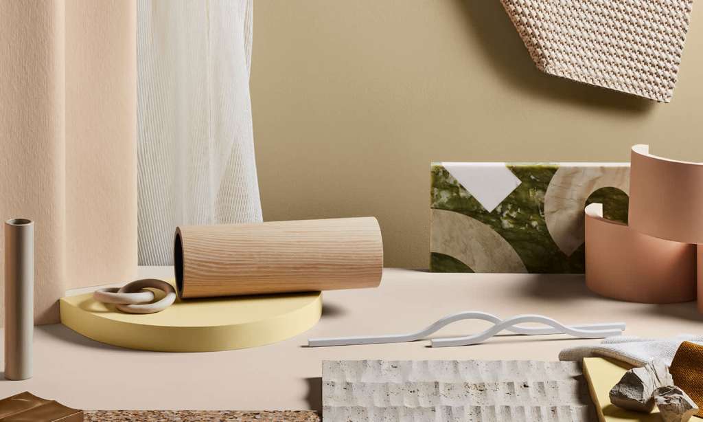
In 2021, it seems we’ll be working a little harder to transform our homes into a soothing, inspiring and fulfilling place.
We’ve perhaps never spent as much time at home as we have in 2020, and in living, working, dating, dreaming and hustling from home, we’ve come to learn how important it is to find peace and comfort inside our four walls, particularly when the world outside feels so uncertain.
Creating a calm, comforting and happy space has truly never been more important, as people continue to spend more time indoors living, working, unwinding, dreaming, dating, distancing, and more.
While technology has become an important part of our homes, for its ability to help us connect with friends and family from afar, it’s fair to say that dwellers are also seeking out a means of switching off at home, to allow them a chance to reflect and recharge ahead of the day’s news.
“This global crisis has changed our relationship with our homes — not just on a practical level, the lines between our work and home have blurred beyond recognition. This also affects us on an emotional level too,” says Andrea Lucena-Orr, Dulux colour and communications manager.
“We need flexible spaces that can multi-task as spaces to conduct our professional lives and perform household tasks, however, at the same time we need our homes to provide balance, calm and a sense of comfort and security.”
Colour authority Dulux has today released its colour forecast for 2021. Summarising its predictions into three soothing palettes — Nourish, Reset and Retreat — Dulux hopes its chosen shades, with a focus on nature and familiarity, will “reflect our desire for reassurance and strength”.
In addition, Dulux considered its palettes, and particularly the pops of colour within, to help lift our moods at home and brighten our outlooks.
“Surrounding colour can be a remedy for the soul in challenging times,” says Lucena-Orr. “This year’s soft, earthy neutrals, muted greens and gentle mauve-greys provide a reassuring connection with nature, whilst richer and brighter hues, such as coral and stormy blue awaken our senses and allow for moments of optimism.”
Reset
Described as an optimistic and uplifting palette of ’70s-inspired brighter hues like coral, warm rust, pink, terracotta and rich blue, Reset is thought out to evoke nostalgic feelings of fun during travel.
“As we retreat indoors, fond memories of past adventures and discoveries inspire our home spaces,” Lucena-Orr says. The Reset palette extends beyond the colours on your walls and bleeds into your decor, accessories and furniture.
Lucena-Orr would suggest styling pieces old and new together, and making the most of soft furnishings in varying textiles like cushions, throws and upholstery in the palette’s shades.
Nourish
A more subtle palette, Nourish was thought out to provide a moodier and more dramatic retreat of your home interiors. The palette is comprised of warm shades that perfectly complement indoor plants, including sage green, mossy and olive green, turmeric and citrus, plus stone-like tans to ground the selection.
Dulux says: “We are facing digital saturation at its most extreme. Craving time and space away from our screens, there is a renewed appreciation for nature and rituals of self-care to help soothe the mind and create an aura of calm and sense of wellbeing. The Nourish palette plays into this longing for natural beauty and earthly connection.”
Lucena-Orr’s tip for the Nourish palette is to start small by painting your front door, or creating an accent wall behind the bed. “Many of the colours in this year’s forecast will work beautifully on exteriors too,” she says.
Retreat
The Retreat palette makes the most of warm whites, brown-based neutrals and dusty blue shades to put forward a sense of luxury and comfort.
Lucena-Orr says: “The Retreat palette feels tranquil and sentimental – reminiscing tradition, whilst hinting at better times to come. It speaks of renewal and growth. As work-life boundaries blur, we look to style our interiors to be hybrid and high-functioning; spaces are mindfully curated with versatile pieces in authentic designs and materials, and art and decoration that has personal meaning.”
With richer blues and grounding tans, the palette is designed to encourage quiet and stillness, and to help people switch off from the stress of digital fatigue.
View the full Dulux colour palettes for 2021 here.
Read more stories from TheLatch— and follow us on Facebook.

