Certain aspects of a restaurant stand out like the food, décor and waitstaff. Others are less noticeable but can still impact your experience. They’re elements like the venue’s music (unless it’s live, of course) and menu design.
I’d never given much thought to menus until recently when I read article, The Psychological Science Behind Menu Design. It explored how diners choose from a menu based on the layout, wording and highlighted items. The menu might push you to order certain dishes and help you decide how much to order and spend.
“Menu design is an essential part of a restaurant’s storytelling,” says Andy El-Bayeh, the article’s author and CEO of marketing agency Example. “It’s like a silent guide, helping guests understand the restaurant’s identity and making their experience memorable.”

In addition to guiding, El-Bayeh says a well-designed menu should also help to maintain a restaurant’s profitability. As Grace McCloskey, a graphic designer at design agency Distil, puts it: “The right layout and visual hierarchy help guide diners naturally to the restaurant’s best features, encouraging sales without ever feeling pushy.”
One way to do this is by placing high-profit items into high-visibility areas on a menu. The theory of the Golden Triangle says when we look at a menu, our eyes typically move to the middle first before going to the right corner and then the top left. These menu areas are then valuable real estate.
“We also use the decoy effect, which is placing a high-priced item next to a moderately priced one which makes the latter seem more reasonable,” says Naomi Ross, director at Distil. “We avoid dollar signs or listing prices in columns, which can make customers focus too much on cost rather than the dish description.”
Other tricks include placing desserts or specials on separate menus, so they feel like an indulgence rather than an afterthought, emphasising visual clarity to simplify the decision process and integrating appetite-stimulating colours like warm reds and yellows where possible.
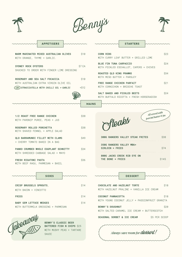
Colour on a menu can also be used to convey an idea. In the case of Benny’s Cronulla, green is used on the menu to reflect the freshness and high-quality ingredients. Varvara Sellies, design director at Sisu Interiors, which created the restaurant’s interiors and menu, said the goal was to mirror the venue’s welcoming atmosphere and identity as a community-centric dining spot.
“In terms of the Golden Triangle, our steaks are placed in the middle of the menu in a highlighted box, drawing attention and emphasising these as our signature dishes,” says Sellies. “Also, dessert ‘Benny’s doughnut’ incorporates the owner’s name, giving it a sense of exclusivity and familiarity, encouraging diners to feel connected to the dish and making it a must-try item.”

At Raes in Byron, the menu aims to set the tone for the entire dining experience. The team recently replaced heavy folder menus with textured paper. The lighter, refined menus are more reflective of Raes’ classy, understated presentation, says exec chef Jason Saxby. No dollar signs or symbols are used to keep it clean and easy to read.
“Menu design varies depending on the dining experience,” says Saxby. “For instance, degustations can afford a minimalist approach as the waitstaff provide detailed explanations, creating anticipation and a more personal experience for the guest.”
With an a la carte menu, on the other hand, each dish must stand out and tell a story to captivate the diner. Raes also has a small prix fixe menu, which presents its own challenges. Since there’s no financial emphasis on one dish over another, all dishes must be equally appealing, ensuring a balanced and harmonious dining experience.
So how are restaurant menus likely to change in the future and how should you be reading them knowing some of their design tricks? Ross says the rise of QR code menus and digital ordering platforms like Me&U have added new layers to menu profitability.
“Digital menus allow for instant updates, meaning restaurants can adjust prices or promote high-margin items in real-time,” she says. “Some of these platforms facilitate dynamic pricing strategies, including ‘surge pricing’ during peak periods, a concept borrowed from ride-sharing apps that can maximise revenue in high-demand times.”
These apps can also provide data on customer preferences, allowing venues to fine-tune their offerings based on ordering behaviour. They can also upsell through strategic prompts like suggesting add-ons or recommending items that pair well together.
So should you look for tricks now when reading a menu? El-Bayeh says he isn’t.
“When I dine out, I let myself enjoy the experience without overanalysing it. Dining should be immersive, a chance to experience the journey the venue intended. That’s where the magic lies.”
Related: Wait, Are We Tipping at Restaurants Now?
Related: You Could Soon Find More Than Olives and Onions in Your Cocktails
Read more stories from The Latch and subscribe to our email newsletter.


